Venn diagrams are a great tool to represent information visually – especially data about overlapping groups. For example, you might have a group of 100 people, 80 of which own a car, 55 of which own a bicycle, and 40 of which own both. A Venn diagram is an excellent aid to help us determine how many people either owned a car or owned a bicycle, or how many people owned neither.
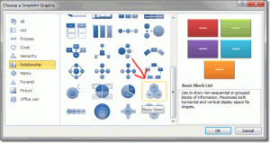
To create a Venn diagram in PowerPoint, all we need to do is add some SmartArt. Go to the Insert tab and click the SmartArt command (in the Illustrations group). The SmartArt window opens with a large selection to choose from. Venn diagrams (and there are four types) are actually in the Relationship category, near the bottom.

The following types of Venn are available:
- Basic Venn
- Linear Venn
- Stacked Venn
- Radial Venn
We’re going to use a basic Venn diagram for this task, so double click on the image of the Basic Venn. There are three circles, but we only need two, so click on the bounding border of one circle and press the delete key.
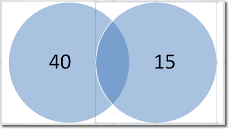
You are now left with two circles, one for car owners and one for bicycle owners. The area where the two circles overlap represents those people who own both a car and a bicycle. Let’s add some numbers. Each circle has a placeholder text box that we can start typing into.

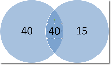
The numbers within the circles were easy to add because we just overtyped the placeholders. For the area where the circles overlap, we’ll need to insert a text box: on the Insert tab, click on Text Box (in the Text group) and click once within the overlapping area. Then type out your number, like this:

You’ll probably need to increase the font size of this new text to make it similar to the existing numbers.
Back to our question: we can see that the number of people who owned either a car or a bicycle is 40 + 40 + 15 = 95, and the number of people who owned neither is 100 – 95 = 5.

