Bar charts in Excel are good at displaying values for different groups for comparison. Let’s look at an example to illustrate how we might use a bar chart.
Yesterday I sat on a bridge and counted how many cars of different colours I saw. Here are the results in a spreadsheet:
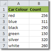
Car colour is what is known as an independent variable, and that should go on the left. The car count is the dependent variable.
To add a bar chart representing our data, select the data and then click Insert > Charts > Bar, and select one of the chart types available. Note that if we select the column headings as well as the data itself, the headings will appear on the graph.
I chose a 3-D bar chart and created this:
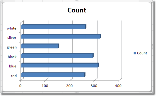
You can see that the way that our data is represented allows to make visual comparisons very easily.
The counts I made above were all in the morning. I had my lunch and returned to the bridge to resume my counting. Adding the new results to the spreadsheet, we now get data involving two independent variables:
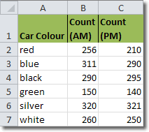
Plotting this data in a bar chart now gives us:
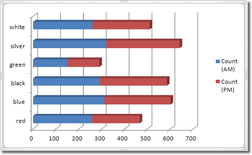
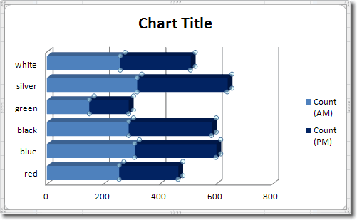
Now we can compare the counts for different colours of cars, and we can see how those differences vary from morning to the afternoon.
Let’s try and make the graph a little more appealing by changing the formatting. Maybe a dark blue would look better on the bars that represent the PM counts. We need to select the “Count (PM)” bars and there are two ways of doing this: we can either click on the bar itself in the graph, or we can use the Chart Element selector in the Current Selection group (Format tab in Chart Tools).
With the “Count (PM)” bars selected, click Chart Tools > Format > Shape Styles > Shape Fill, and select a colour. Choosing Dark Blue gives this:
