Column charts in Excel are good for plotting data that is arranged in columns or rows of your worksheet. If you need to show how data changes over time, a column chart might be a good fit. Whereas scatter charts plot actual values along the x-axis, column charts use categories.
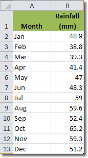
Let’s look at an example. Here is some data that shows how rainfall varies month by month.

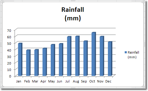
If we present that data in a column chart we will be able to see what’s going on more clearly. Select the data and the headings and then click Insert > Charts > Column. I selected Stacked Column in 3-D.

Because we selected the headings as well as the data, Excel knows that it should display “Rainfall (mm)” in the legend to the right. Months are plotted along the x-axis (the categories), whilst the actual rainfall in mm is plotted along the y-axis. This column chart gives us a good way to compare monthly rainfall figures.
Although we selected a 3-D column chart, the 3-D effect is very subtle. If we increase the rotation of the columns, we can add more depth. With the chart selected, click Chart Tools > Layout > 3-D Rotation. The Format Chart Area window opens with the 3-D Rotation tab active. Click on the up arrow to the right of the X rotation input box until the value is around 30 degrees. Nice. Do the same to the Y rotation value to get a much more striking 3-D effect.

