Conditional formatting in Excel allows you to highlight cells whose data satisfies certain criteria. For example, you might want to highlight sales margins on products that are less than 5%. Or you might like to highlight sales people in your tean who have achieved more than their targets. Excel enables you to apply formatting to cells that meet certain criteria that you specify.
What conditional formatting aims to achieve is to give you a visual way of representing your data that is more easy to take in and understand than merely presenting numbers in a spreadsheet.
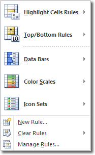
To apply conditional formatting in Excel 2010, select the cells you want to analyse and then click Home > Styles > Conditional Formatting. The following smorgasbord of options is made available:

Here is a very brief rundown of what each options does.
Highlight Cells Rules
When you choose this option you can highlight data that:
- is greater than a value
- is less than a value
- is between a high and low value
- is equal to a value
- contains a value
- is a date that occurs in a particular range
- is either unique or duplicated elsewhere in the worksheet
After you choose one of the options above, you must then enter a value against which each cell is compared. If the cell data satisfies that criteria, then the formatting is applied.
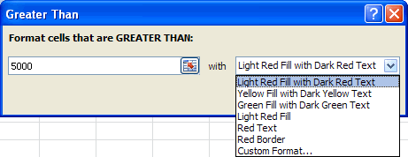
Let’s pretend you want to highlight all data that is greater than 5,000. You would click Conditional Formatting > Highlight Cells Rules > Greater Than. The following dialogue box opens.

As you can see, there is a box for you to enter the “greater than” number, and also a drop down list to select the highlight you want to apply to all cells greater than 5000. If you don’t like any of the pre-made formatting options, you can select Custom Format and specify your own.
Top/Bottom Rules
Whereas the Highlight Cells Rules (above) involve comparison of cell data with values that you specify, Top/Bottom Rules apply formatting to cells whose values fall in the top x% or the bottom y% etc. The actual options here are :
- top 10
- top 10%
- bottom 10
- bottom 10%
- above average
- below average
Data Bars, Colour Scales, Icon Sets
Data bars, colour scales and icon sets all provide a colourful, graphical way to provide a visual representation of how the data in each cell compares to the other cells in the worksheet.
- Data Bars: a coloured bar is displayed as the background for each cell and the length of the bar corresponds to the size of the data relative to the other data in the worksheet. The longer the bar, the greater the value in the cell.
- Colour Scales: each cell is coded according to a preset colour scale. Select More Rules to get an idea of how the colour scale is set up.
- Icon Sets: you can set rules that state that certain icons are displayed when a cell’s value is greater than, equal to, or less than values you specify.

