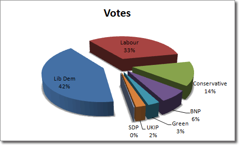
Unlike other charts in Microsoft Excel, pie charts require that data in your worksheet be contained in only one row or column (although an additional row or column can be used to indicate a “category”). Each piece of data is represented as a portion of a whole, so relative sizes are easy to compare.
Here is a breakdown of the votes for each party in a particular consituency in the UK. We’ll use this data to create a pie chart. Don’t worry if you don’t know what this means as it’s just the numbers we’ll be looking at.
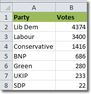
Select the data, including the headings, and click Insert > Charts > Pie, and select a chart type. I selected one of the 3-D pie charts and created this:
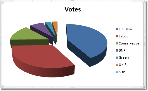
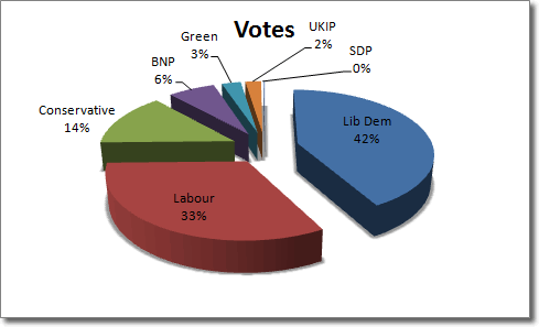
You can see the relative size of each piece of data quite clearly. Each party has its own colour, making it easy to identify it in the pie. Notice that because we selected the headings as well as the data, “Votes” was used as the pie chart’s title, which is just fine.
The beauty of charts in Excel 2010 is that they change immediately to reflect the data in your spreadsheet if you choose to amend any of the figures. I’m not suggesting that you engage in vote rigging, but if you change the number of votes that the Green party received to 5,000, you will see their portion of the pie chart expand to reflect your change.
Adding Percentages To Pie Charts In Excel
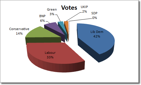
There are some useful additions that we can make to this pie chart. We can see at a glance how big the share of votes each party received as a proprtion of the whole, but we can also add some percentages for the number crunchers to look at. With the chart selected, click Chart Tools > Design > Chart Layouts > Layout 1 (the first one). The percentages are added to each pie that correspond to the percentage of total votes.
Adding Shadows
We can give our pie chart a little more depth by adding a shadow to each pie slice. First of all we need to select all the slices by clicking Chart Tools > Format > Current Selection > Series “votes” (or whatever your date series is called). While you are still on the Format tab, click Shape Styles > Shape Effects > Shadow, and choose one of the shadow options.
This is what we should end up with:
Rotating The Pie Chart
Suppose we decide that the pie chart would look better with the smaller slices at the front. We can rotate the chart by selecting it and then clicking Chart Tools > Format > Shape Styles > Shape Effects > 3-D Rotation > 3-D Rotation Options. When the Format Chart Area window opens, use the X rotation input box to bring the smaller slices to the front. The chart rotates immediately, so you can keep clicking the up arrow to the right of the input box to rotate the chart in small increments until it is in the right position. After a 170 degree rotation, we have something like this:
