If your worksheet contains data that is arranged in columns or rows then using an area chart may be a good way to display that data. Area charts emphasize the magnitude of change over time, and can be used to draw attention to the total value across a trend. Area charts are good for emphasizing totals. They offer the time-tracking qualities of a line chart but also display relative proportions very well. You can visualise area charts as being line charts with different colours in the areas below the lines.
By displaying the sum of the plotted values, an area chart also shows the relationship of parts to a whole.
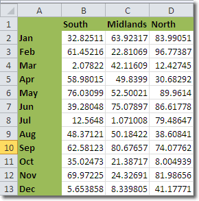
Let’s look at an example. Here is a worksheet containing average rainfall figures for different regions.

We can plot that data in an area chart by first of all selecting it. Make sure that you select the column and row headings – these will then appear on the chart itself.
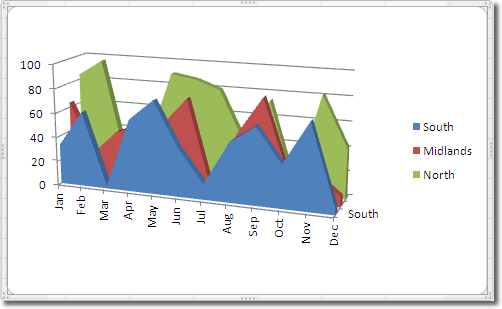
Click Insert > Charts > Area, and select a chart type. I selected a 3-D area chart and created this:

It looks good, however, can you see a potential problem with this area chart? Some of the coloured areas in the background are obscured by those in the foreground, so you can’t see how the rainfall varies. The way we can get around this is by giving the areas some transparency.
Area Charts Transparency
Unfortunately, Excel 2010 only allows you to set transparency for area charts one data series at a time. In our example, we have only 3: South, Midlands and North, but imagine how tedious this would be if you had more.
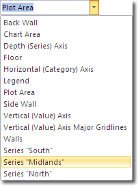
Select the first data series you want to make transparent by clicking on it in the graph. This may be easy for the data series at the front, but tricky for the ones behind it. Another way to select a data series is by using the Chart Element selector in the Current Selection group on the Layout tab.

With the data series now selected, click on the Format Selection button in the same group on the ribbon. Choose the Fill section in the Format Data Series window that opens, select Solid Fill and then drag the transparency slider to the right to make the data area more transparent. Ensure that the solid colour selected is the one you want. When you click close on the window, the transparency will be applied. You can then repeat the process for all data series that you want to make transparent.
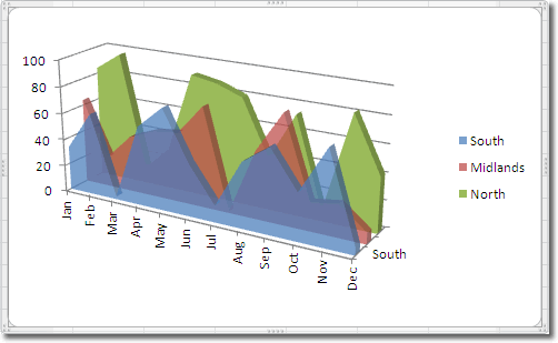
To add a bit more depth, I changed the 3-D rotation of of the area by clicking Chart Tools > Background > 3-D Rotation and adjusted the X and Y rotation values. This is the result:

This graph looks much more attractive, and it has the added benefit of allowing viewers to see how the data series in the background vary.

